This project began with the search for a reliable data set that aligned with our goals. We ultimately selected a data set documenting recorded tornadoes in the United States from 1950 to 2021. This data set was particularly valuable because it allowed us to explore how tornado patterns have evolved over time. By analyzing trends in tornado frequency, intensity, and impact, we developed critical questions to deepen our understanding of extreme weather events.
The data set was comprised of numerical and categorical data for all recorded tornadoes in the U.S. from 1950 to 2021. The represented columns for the data set were as follows:
- year
- month
- day
- state
- EF level (magnitude)
- injuries
- deaths
- start and end longitude
- start and end latitude
- length (miles)
- width (yards)
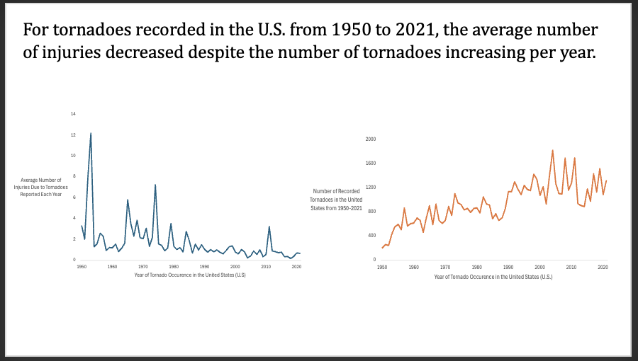
First question: From 1950 to 2021, is there a change in the average number of injuries associated with the average number of tornadoes each year?
This question resulted in the creation of two separate time-series plots. While both have ‘year’ along the x-axis, the y axes of either differed, indicating that two separate graphs were necessary.
For the first plot, we used a pivot table to gather the average of the number of injuries per tornado for each year. For the second plot, we again used a pivot table, but focused on the count of tornadoes for each year of the recorded data.
The result from the printed plots (see slide below) show that there is an inverse pattern between the two. Despite the number of tornadoes increasing over time (right), the average number of injuries were seen to decrease (left). This evidently shows that, through the decades, there have been significant improvements in tornado detection, safety measures, and shelter infrastructure. These advancements aim to address the growing impact of climate change and the increasing variability of extreme weather events.
As for the aesthetics of the plots themselves, all the components were created in excel. We formatted the plots by removing the chart titles, grid lines, and borders. In fact, we did this for all of our graphs. For either plot, we added descriptive storytelling principles so that they are compelling, simple, and easy to understand.
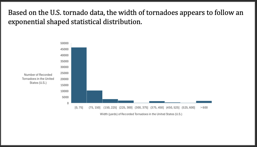
Second question: Historically, what is the distribution of tornado widths?
This question clearly referred to a histogram chart. In order to create this graph, we filtered the data using a pivot table to focus on the widths of each recorded tornado. By default, the size of each bin was too small, so we enlarged the bins to increments of 75 yards. We then added an overflow bin for the very small number of larger width tornadoes.
The histogram that resulted from the data set follows an exponential shape (see below). This is as expected due to the fact that smaller tornadoes are far more common. In fact, this is a good thing, because if the results did not show this type of distribution, then our data would likely have some major inconsistencies. It would also indicate that we are in danger of more frequent extreme tornadoes.
As for the aesthetics of the histogram itself, all the components were created in excel besides the vertical axis title. We added this in PowerPoint, as excel does not allow vertical axes titles to be formatted horizontally.
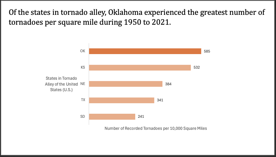
Third question: Do states in Tornado Alley show similar patterns in tornado occurrences from 1950 to 2021, or are some consistently more affected than others?
This question resulted in the creation of a bar chart. To make this chart, we first filtered the ‘state’ column to only show states in tornado alley. We manually deselected all states, then chose the 5 major states in the alley, leaving us with South Dakota, Texas, Nebraska, Kansas, and Oklahoma. We then used a pivot table to gather the counts of the recorded tornadoes for each state.
When doing so, however, we ran into the issue that some states are simply larger than others, so the results didn’t truly show us anything worth telling. The larger states, such as Texas, were showing the highest number of occurrences. As a result of this, we decided to alter our approach by finding the square mileage of each state.
By dividing the count of tornadoes from each of the five states by the square mileage of said state, we were left with the number of tornadoes per square mile. These numbers were very small decimals so we again adjusted our approach and multiplied the results by 10,000, giving us easier numbers to work with. Consequently, we were left with conclusive results that were rather compelling.
The outcome proved Oklahoma to have the highest number of tornadoes for its size, with Kansas coming in close second.
As for the aesthetics of the chart, all components were created in excel. We added row labels to each bar and rounded to the nearest whole number (can’t really have half of a tornado). We then shaded the bars in a way that brought the attention to OK.
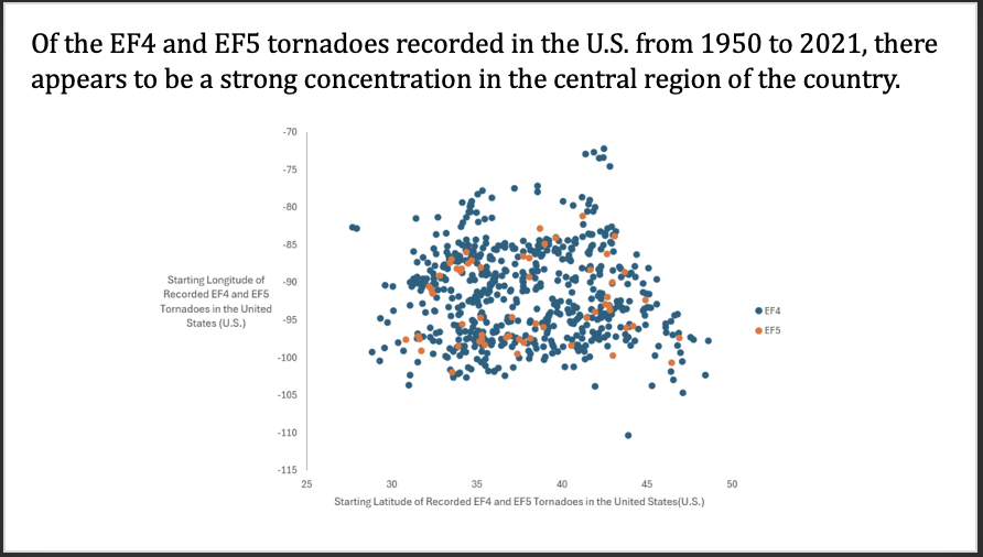
Fourth question: Is there a geographical pattern of the most deadly tornadoes (EF4 and EF5) recorded in the U.S. from 1950 to 2021?
This question led us into our fourth and final type of plot. To develop this scatter plot we first had to filter the magnitude column to show only EF4 and EF5 tornadoes. We initially tried to use a pivot table but it proved to be cumbersome. Due to our data having the starting and ending latitude and longitude for each recorded tornado, we decided to choose just the starting locations (the touch down locations).
Next, we copied the starting latitude and longitude columns (which were filtered by magnitude) and pasted them into a blank worksheet. From here, we could simply highlight the data and insert a scatter plot.
Grant found an effective way to represent which dots on our graph corresponded to EF4 tornadoes and which corresponded to EF5 tornadoes. This helped to also show the difference in frequency of either type.
Based off the results we were able to determine that there has been a strong concentration of the deadliest type of tornadoes in the central region of the U.S. In fact, to better show the actual location, we attempted to paste a transparent map of the U.S. (ensuring to line the latitude and longitudes correctly) but it simply did not work as we had hoped.
As for the aesthetics of the plot, all of the components were created in excel. We then added a legend and thorough axes titles for clarity.